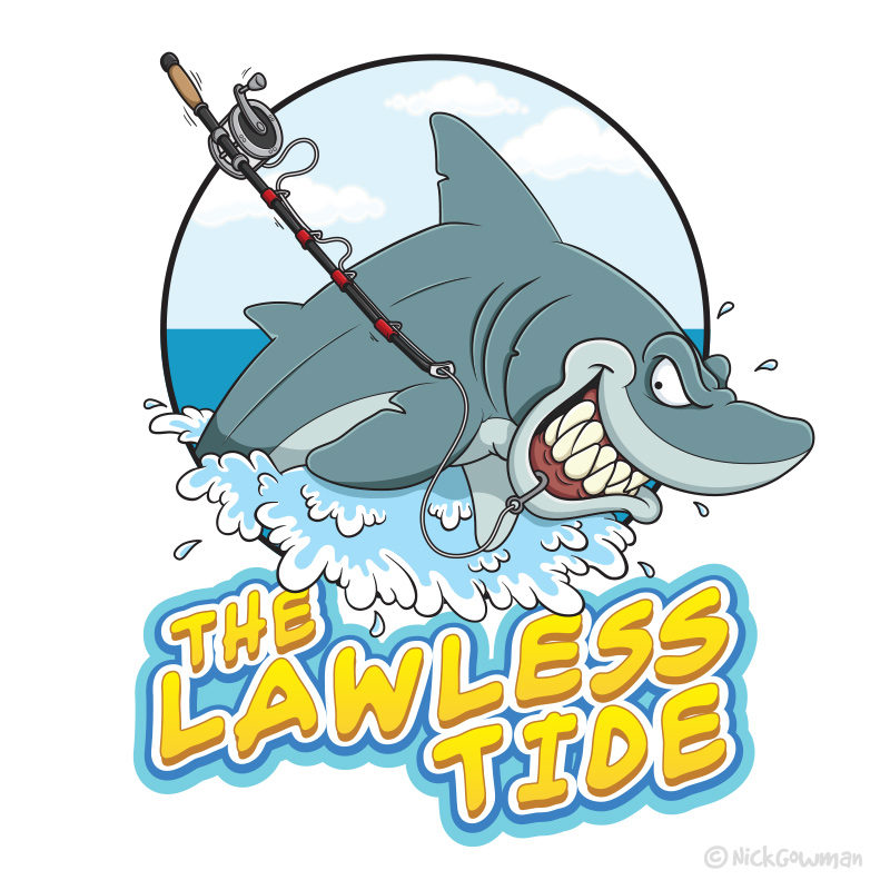
I’ve recently completed the design of a shark logo for a client who runs a fishing channel, The Lawless Tide!
The brief
My brief was to create a dynamic and eye-catching shark logo design for a fishing channel. The shark needed to be leaping out of the waves, pulling a fishing rod behind him – snatched from a shoreline fisherman!
Sketches and ideas
As always, my first port of call is a few quick sketches to get a feel for the piece. I’ve drawn several cartoon sharks in the past so already had a feel for how he might look.
I wanted to make sure he looked very energetic and mischievous, with lots of emphasis on his sharp teeth! I had to ensure that the fishing rod was also very easy and clear to see, being such a slender object.
There was also the requirement for some waves that the shark was ploughing through.
Experimenting with composition
Once I had a look for my shark logo and an idea of the composition, I experimented with the placement of the elements.
As this was to be used as a channel logo/avatar I also needed to ensure it would fit within a square. I also toyed with the idea of whether the waves would be contained within the circle, or spilling out.
Creating the shark logo
Once the pencil sketches and composition were approved by the client, it was time to digitise the outlines.
This was all done in Illustrator as a vector artwork – the main advantage to this being the artwork can be easily amended. It also has the advantage of being able to be scaled to any size without any loss of quality.
Once all outlines were completed, base colours were added, followed by all shading and highlights.
Shark logo text
As with the existing videos on The Lawless Tide channel, I needed a typeface that would suit the feel of the logo.
This needed to be fairly loose and relaxed, but also bold enough to be viewed at a small size. The request was that it would also need to be yellow to match the existing channel lettering.
Once I’d played with the letterforms and arranged them into a looser format, I bulked up their appearance. After that, more wave-like shapes were added behind to help give more impact to the text against the busy shark.


