About this cartoon...
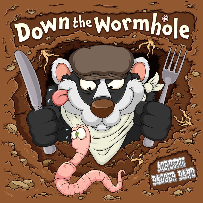
This piece was created for a cartoon badger band album sleeve, depicting a rather hungry cartoon badger heading down a wormhole. The entire piece was sketched in pencils to get a sturdy and balanced composition. The sketch was then taken into Adobe Illustrator and realised into a complete vector illustration.
“Going down the wormhole to find a tasty treat. Everywhere that badger goes, a worm he likes to eat.”
The cartoon badger band character
The main cartoon badger character is drawn face-on, with a knife and fork in his hands in the classic hungry character pose. A napkin has also been added around his neck.
This front-facing pose was a little unusual to draw, as my character designs are usually from a 3/4 perspective, so most of his face is hidden underneath that flat cap.
A cartoon worm
A focal point of the album’s title track is that our cartoon badger is on his way down the wormhole to find his dinner. Therefore, we needed to work on a slightly alarmed cartoon worm character to sit in the foreground.
A bright pink colouration was selected so the worm character stands out well against the brown of the dirt tunnel. I’ve also added some highlights to it to give the impression it’s a bit slippery and slimy.
The worm cartoon character was drawn with a double purpose in mind, so he could be easily separated from the background if required. This will allow it to be used on social media and separate pieces of badger band merchandise.
The wormhole
The tunnel was interesting to create, as only working in a flat colour medium, I needed to convey some depth. This was achieved by varying the tones of brown, going from light to dark.
Various small stones and pebbles were added to the dirt tunnel, along with some roots poking through. A small region was also created in the corner to house the band’s logo.
The main title was added last into a ‘dug out’ region. Each letter was then manipulated slightly to add some fun angles. The edges of the typeface were also rounded off and a gradient was applied over the top.
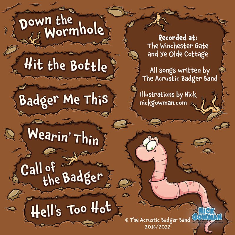
A back cover was also designed for the EP, carrying over the same design feel. Each of the song titles were created in the same ‘dug out’ style and listed down one side. Our cartoon worm has also been added – and it looks as thought he might have made a lucky escape… this time…
