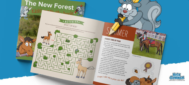
I’m very excited to announce the launch of something I’ve been working on with The New Forest Heritage, a brand new children’s activity book! This fact-filled children’s book is full of puzzles and information about our wonderful new Forest.
The brief on my part was to provide a series of woodland cartoon characters, along with some activities and a new central mascot character – a young female New Forest pony named Piper.
These would then be placed at regular intervals throughout the publication to support articles and fun animal and nature facts.
Early character sketches and development
Piper went through various stages of development before we decided on the final design. We wanted to get this right before proceeding with the various activities she’d be doing.
Some of my first sketches looked good but were too bulky. Piper is a very young pony and so needed to be a little gangly. To achieve this I decided to make the legs and head more elongated, with exaggerated knee joints.
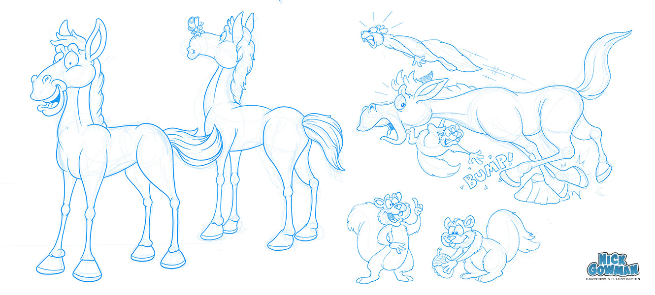
I also suggested that Piper could probably do with a couple of other characters to bounce off of and that would accompany her through the book. These came in the form of the Squirrel brothers!
I chose squirrels because they are also abundant in the New Forest and due to their small size and build, could be up to all sorts of mischief throughout the book.
Piper was then fully visualised as a vector illustration, with crisp outlines and solid colours. Shades and highlights were then added to create depth and definition.
Woodland cartoon characters
Along with those naughty squirrel brothers, there was the requirement for some more woodland character designs for the activity book.
These came in various forms, including a cartoon snake, some deer, cartoon spiders, King William and even a greedy cartoon pig, eating his way through a large plate of acorns!
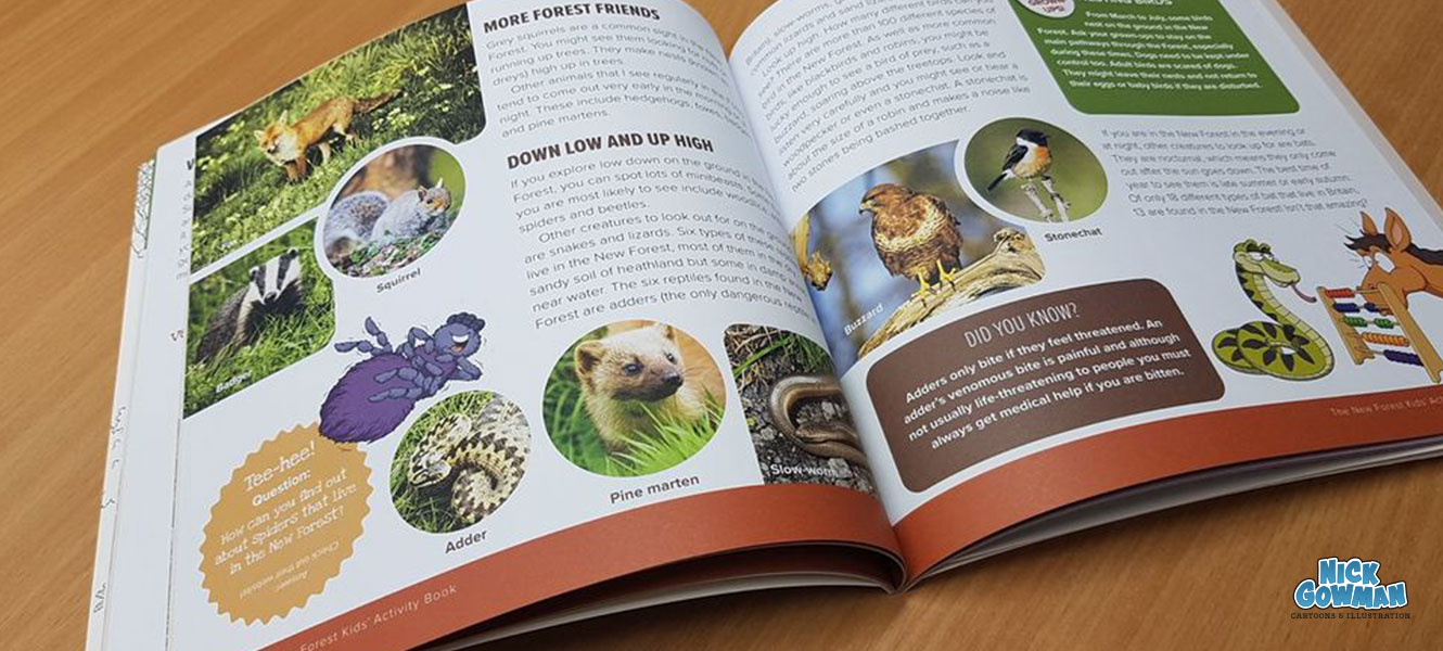
The layout of the children’s activity book
The designers very kindly supplied me with a rough digital layout of the book. This came complete with an accurate draft of the text to be used and the positioning of the elements.
This then left me with a series of blank spaces into which I would place my illustrations. It worked very well, as I could see how big the cartoons needed to be and whether we could overlap some elements to make the overall design even more exciting.
I added some rough sketches over the top and sent the PDF back to the designers. They approved and this gave me my blueprint to create some more accurate cartoon sketches. Off we go!
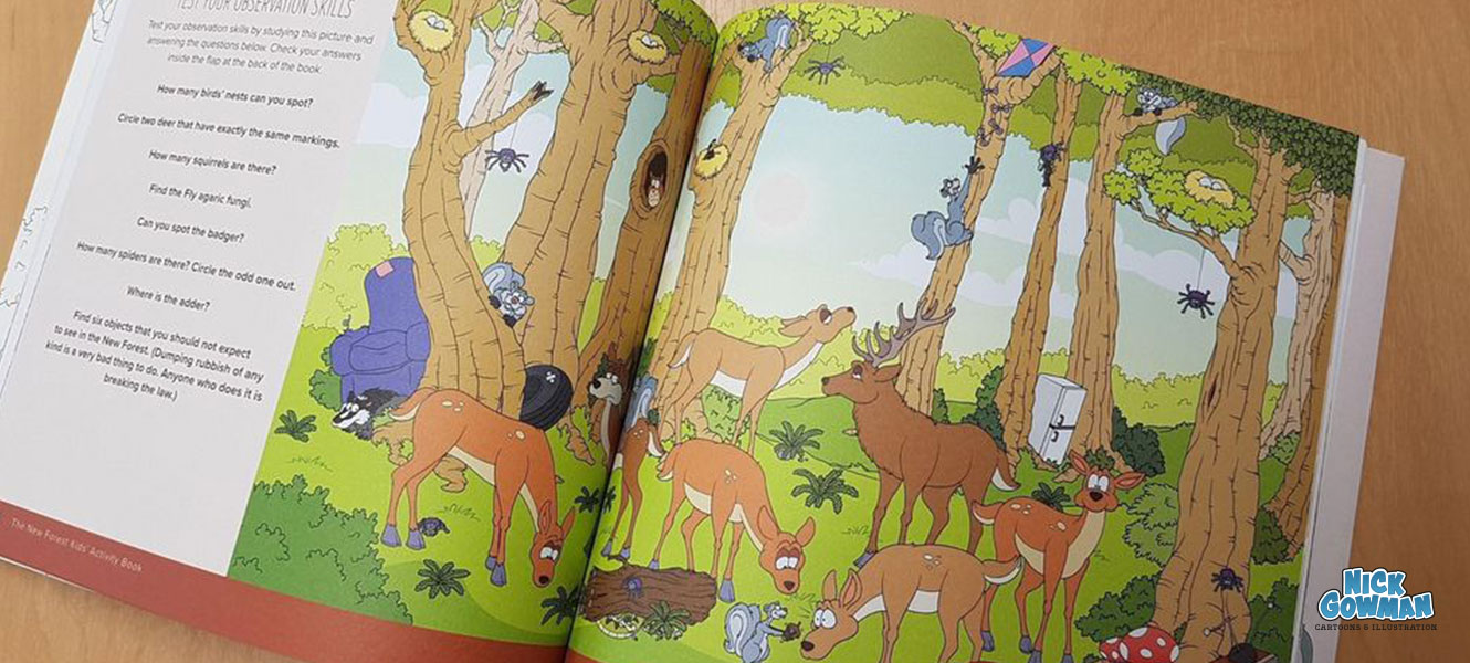
The activity book centre spread
This was the big illustrated piece for the activity book – the centre spread. This would form a large woodland scene packed with various things to find, including:
- A whole herd of deer, with subtle differences between them.
- Various spiders, squirrels and birds nests to find and count.
- Other woodland critters to find.
- Sadly, some flytipping too, with abandoned fridges and other man-made elements.
The front cover
Of course, no one will read the inside of a book without first being attracted to it via the front cover. These were the last set of cartoon characters that I created for this project, as by this point, I had their personalities down.
A large photograph of a pony would provide the main focus of the front cover and then be supported by my illustrations. This would ensure it remained consistent with the existing New Forest Guidebook.
I ran through various layout suggestions with the designers, again using the same principle of creating some unpolished visuals with rough sketches of the characters to show pose and positioning.
The outcome
The client was delighted with the activity book, as was I! The illustrations came out beautifully, with crisp solid colours and the front cover had a lovely silk finish, giving the overall product a wonderful texture and feel. Very pleased with this one.
Would you like a copy of the activity book?
Purchase your copy over at the New Forest Heritage website
