A very exciting commission came my way recently in the form of a classical guitar album cover with a little cartoon personality on the front.
This was a cartoon design for classical guitarist, Mark Hussey, who wanted to inject a little humour into his next classical guitar album.
The title of the album was ‘Laid Back’ and contains many classical songs played in Mark’s unique style.
So with a brief and a few quirky ideas in my head, I set about getting started.
The classical guitar album front
Having seen several of my cartoon artworks, Mark approached me to capture a version of himself, playing live on stage, in my own quirky cartoon style.
He wanted to reproduce his stage environment, with a backdrop of a red curtain and a single spotlight above him.
I created a sketch of Mark first, propped up on a stool with classical guitar in hand.
My first concept had a ‘concentrating’ face, but looked a little too serious, and given the name of the album he needed to look more ‘laid back’.
I suggested that we could also include a crowd of people watching him, but not simply the backs of their heads and there should be a range of expressions and moods.

The classical guitar album back
There was also the requirement for a back cover of the album too. This initially started out as a plain coloured background, with the list of tracks presented to the side.
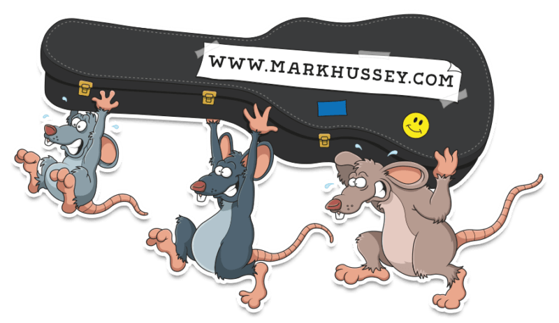
I felt there was something missing, and seeing as I have a love for cartoon rats I suggested to
Mark that we include an additional cartoon on the reverse in the shape of a team of rats, scurrying off with one of his prized guitars!
Development
Mark also queries with the idea of possibly including an artwork on the disc itself, to continue the theme across the whole project.
This added another nice dimension to the project, as I was able to simply take the existing artwork of Mark and add his to the side of the disk.
Obvious themes like typefaces were carried across and also chose a nice, rich shade of blue to work alongside the red used in the curtains on the front (red, white and blue – see what I did there folks?)
There was also a small space remaining on the front of the disc, and seeing as the rats went down so well with Mark, he requested that we add another cheeky little chap in.
Outcome
In all, a very fun artwork piece to be involved in and one that I feel came out really well. The colours printed nice and strong and being that it was all produced as a vector file, the linework was very crisp and vivid.
Why not pop over to my portfolio and view the final album sleeve artwork?
Client Feedback
I recently challenged Nick to come up with a design for my recent solo classical guitar album ‘Laid Back’. Nick listened to my requirements, was thoughtful, timely and produced exactly what I had been hoping for, a great album cover. I could not recommend Nick more highly for his artwork and design skills. A very talented man indeed.


