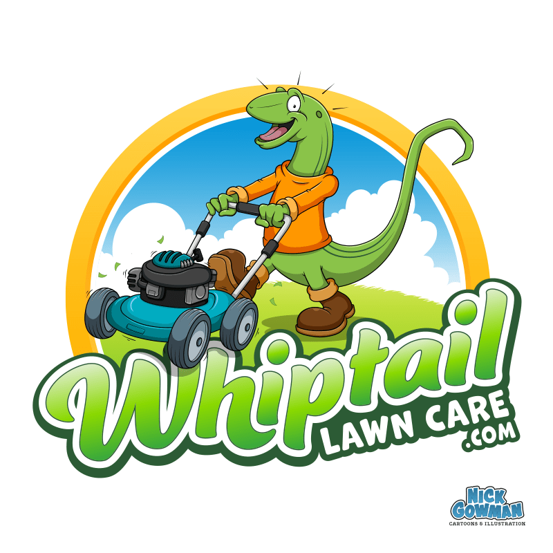
Recently, I had the extra fun commission of creating a happy little cartoon lizard mascot for a lawn care company.
The client had seen examples of my work and the process undertaken to create a cartoon mascot and commissioned me to design a character that would not only feature on his new cartoon logo design but could also be used around his website and social media.
Drawing a cartoon lizard mascot
The first stage when designing the lizard mascot was to get an overall feel for the character. As it had to be based on the Whiptail lizard, some research into the animal was required. They are rather slender by nature but have a long, whip-like tail (hence the name).
The character needed to be friendly, colourful, recognisable and easy to create in additional poses (as this was stage two of the plan).
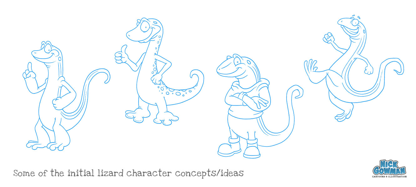
I created several different rough sketches, varying the characteristics of the lizard. This is a fun stage of the process, as I can rapidly try out combinations of features to build up some concepts. I experimented with varying sizes of heads, limbs, eyes and tail lengths to add energy and personality. These sketches were refined and tidied up before sending to the client for review.
Refining my cartoon lizard sketch
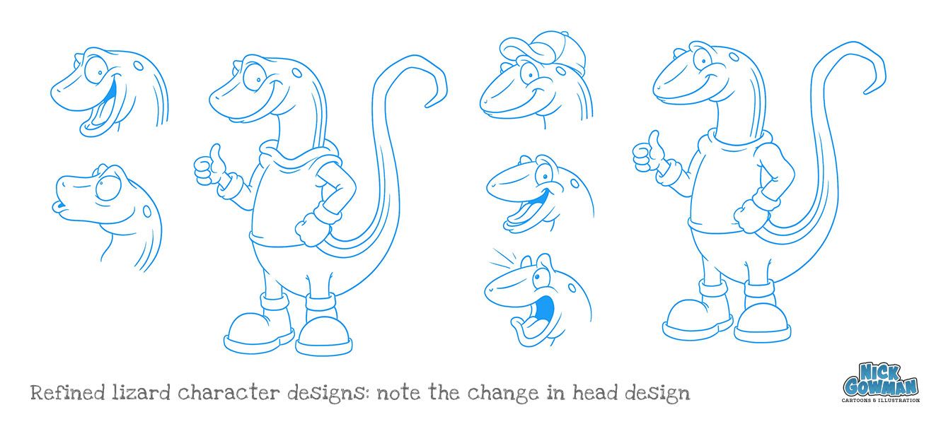
A refined sketch was put together based on the client’s feedback and his favourite elements of the initial sketches. These details included a set of work boots and a bright orange hooded top.
The mascot was refined further with a switch out of a more streamlined head, and the hooded top was simplified down to a sweatshirt. A cap was also experimented with but later removed.
Creating the cartoon lizard logo
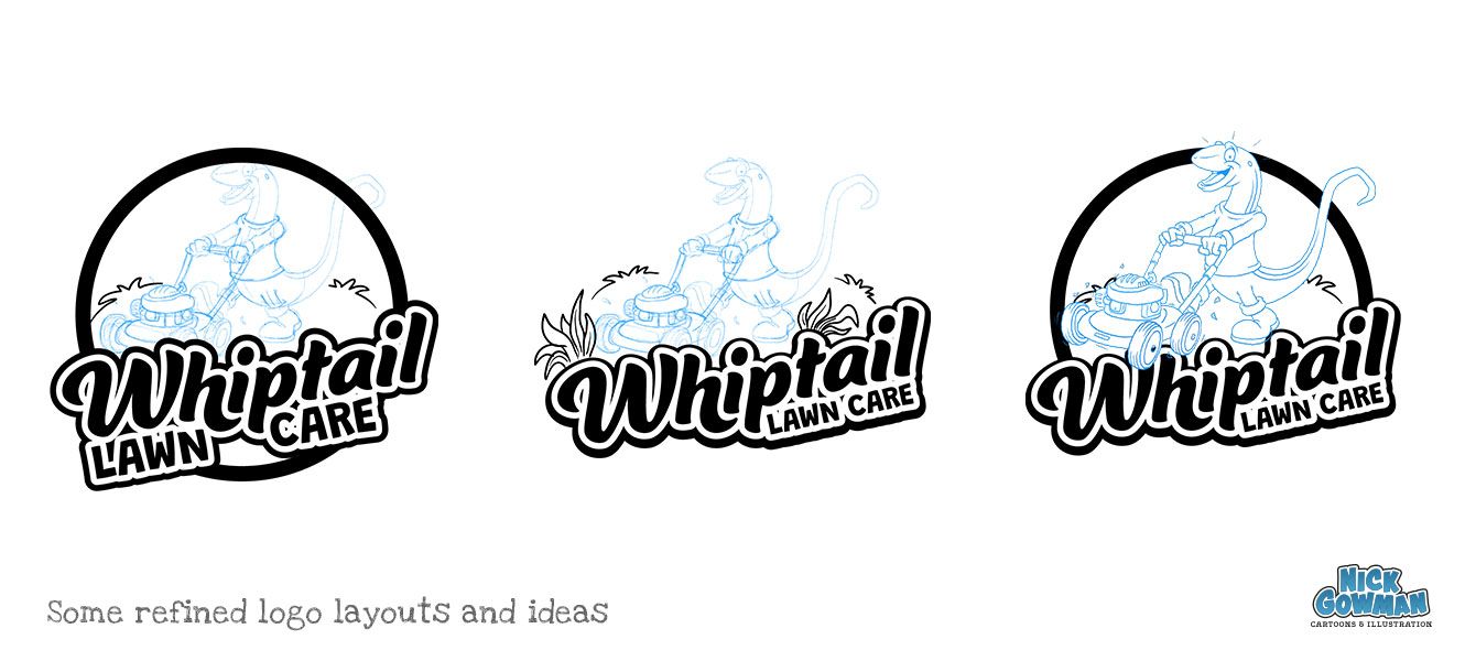
As a logo design would be required to house our new mascot, I created several rough layouts and ideas for the logo composition. This would need to incorporate the lizard character, lettering and supporting elements.
A selection of possible typefaces was also chosen and presented to the client, along with my thoughts and recommendations. The chosen typeface was then manipulated slightly to form a logotype that would work as part of the logo and as a stand-alone element.
This was then layered on top of some rough sketches to allow a quick method to experiment with the layout, sizing and composition. A supporting typeface was also chosen to contain a strapline and a web address. This would then be incorporated into the main logo text.
Adding some colour…
Being a lawn care company, shades of green are a must. The client was also set on a nice, bright colour for the sweatshirt. This would be either an orange or yellow/amber colour. This would stand out against the green and reflect the style of the clothing worn by the employees.
I tried several different palettes of colour, varying the greens and oranges. Contrasting colours were also selected for the lawn mower. We tried reds and blues but settled on a nice light cyan.
Once the colours were set for the character and lettering, some nicely contrasting rolling hills and sky were added to the logo. The design was then topped off by a bright golden circle, encasing all the elements.
The outcome…
The completed logo design was a resounding success and the client was overjoyed with the outcome. Additional graphics were then designed for the company vehicle livery. These consisted of large eye-catching visuals of both the phone number and email address. These naturally followed the same vivid greens.
Why not head to my cartooning portfolio and look at the final completed cartoon lawn care logo.
Can I help you with a bespoke cartoon company mascot?
If you need some custom cartoon mascots for your next project, get in touch!
