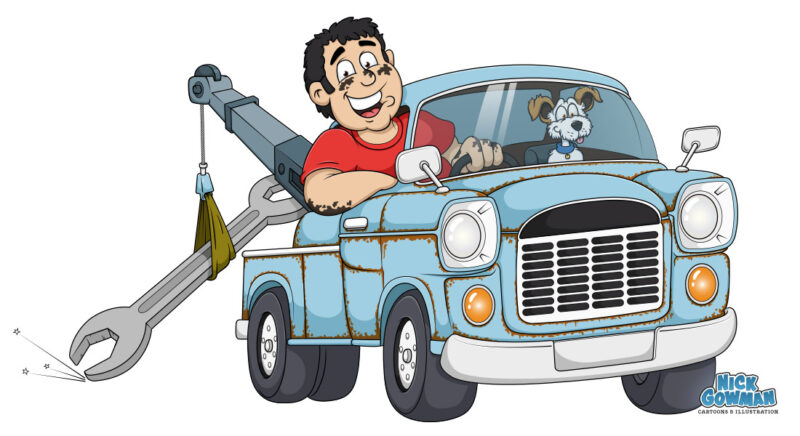
I had a great deal of fun creating this cartoon logo design of a recovery truck for a local company. My brief was to design a fun cartoon logo depicting the recovery truck and two smiling occupants.
The cartoon recovery truck also needed to be towing a large spanner, with sparks sparking from the trailing edge. This kind of madness is right up my street, so I reached for the sketchpad…
Starting the recovery truck pencil drawings
The client had an idea in their head of what they wanted for the logo. It needed to have energy, be eye-catching and above all, fun! The recovery truck also needed to be based around a specific model – an Mk.1 Transit truck. Usually, when I draw I don’t tend to use a lot of references, but on this occasion it was essential.

There was the requirement for a cartoon version of the business owner leaning out of the driver’s window, accompanied by his furry companion – a cute cartoon dog! Neither of these had to be a caricature but just capture a likeness. The company name would later be incorporated as a road or similar, like the truck is speeding away over the top of it.
I created a couple of rough initial sketches from a variety of angles and the client fell in love with them immediately. The front-on angle was preferred and this was refined into a tidier pencil visual.
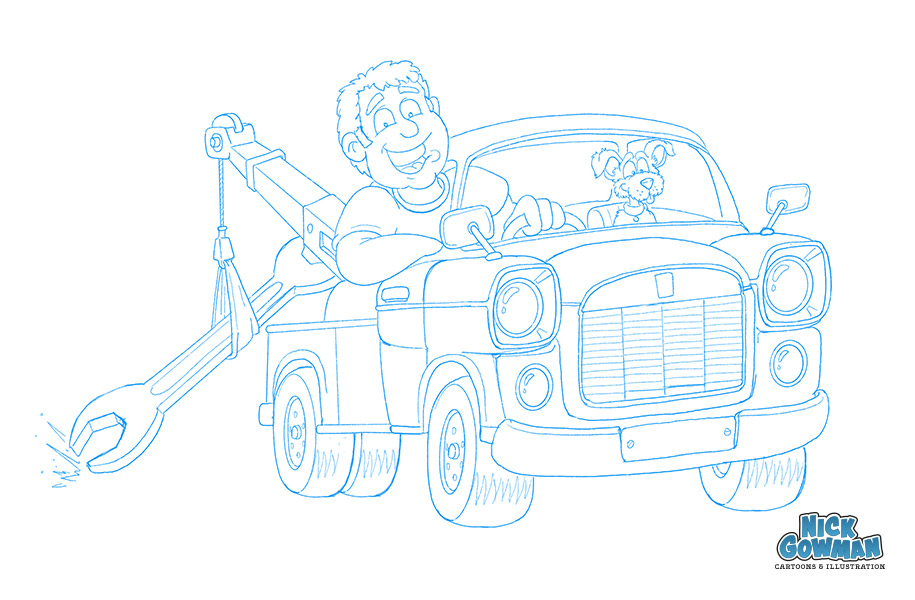
Creating the cartoon recovery truck logo vector
Once the pencil drawing had been approved, I moved onto creating vectored clean outlines for the truck and its occupants. I generally work in vector 99% of the time when designing a cartoon logo.
The main advantage of creating the logo as a vector is that the colours and lines are always much crisper. You can also scale the logo to any size without loss of quality.
It means it can be used across a variety of mediums – very useful when creating merchandise or vehicle signage. I’ve written a blog about the advantages of vector over bitmap images here.
The cartoon recovery truck had to be in a traditional light blue. This meant that we needed a bright contrasting colour for the driver’s shirt. We chose red, as this was striking and would also show up at a small size (social media avatars and the like).
The cartoon dog was great fun to do, with all his scruffy fur. I made sure he looked as cheeky and cute as possible, tucked away in the passenger seat.
Adding rust and ageing the cartoon vehicle
Another requirement for the recovery vehicle cartoon was that it had to be aged. So I had to go about adding in rust to the truck in my usual style. This raised a few concerns, as I was worried it might look more like someone had put chocolate mousse all over it!
I went to work with a brown, rust-colour and began drawing in the rust patches on all the vehicle panels. The more I did, the more I liked it and was happy with the result. The driver also needed to look a bit oily, so we used the same technique there too.
Adding in some cartoon logo lettering
The final stage once the actual recovery truck vector cartoon was complete was to add the company name. From the beginning, it was to be placed underneath the truck, like it was being driven over.
Being a logo design, and also the nature of the business, it needed to be a chunkier typeface. I supplied several choices and discussed how they might be positioned underneath.
You can take a look at the final design over on my cartoon logo page!
Do you require a cartoon logo?
If you like this cartoon logo design and feel something similar could work for your business, please get in touch!
contact me